Rebuilding a Brand for Inclusive, Equitable Health Access
Massachusetts Health Connector
Why This Project Mattered
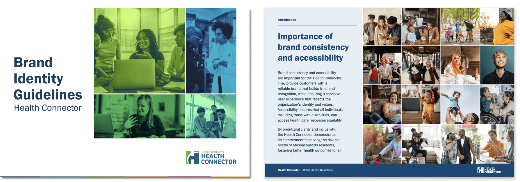
Massachusetts Health Connector (MACHC) needed a refreshed brand system to improve consistency, clarity, and inclusivity across its materials. Our updated guidelines ensure everything is accessible, cohesive, and reflective of the communities MACHC serves.
Approach and Delivery
We overhauled MACHC’s visual identity to support clear communication at every level. The refreshed system strengthens readability, improves consistency, and centers inclusion in both tone and design.
Improving Accessibility Through Smarter Color Use
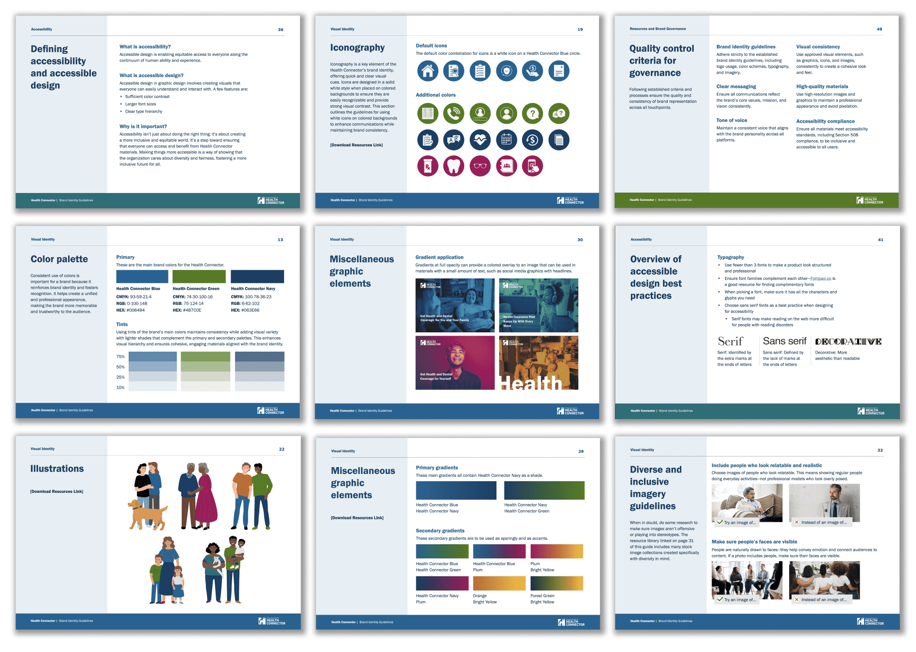
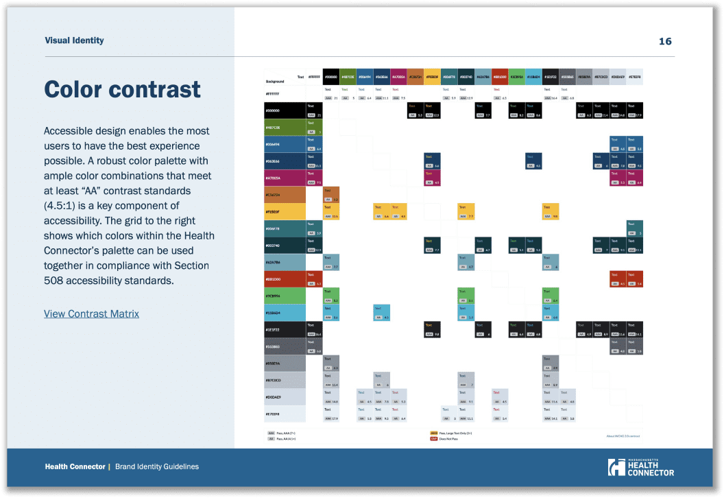
We expanded MACHC’s palette to include more accessible color combinations—making materials easier to read and navigate for a wider range of users.
Clear Navigation for Easier Use
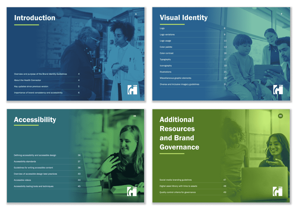
Section markers were added to help readers track their place and move through documents more easily—making dense content feel simpler and more approachable.
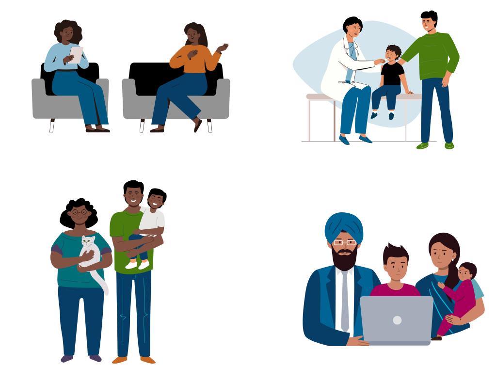
Visuals That Represent the People MACHC Serves
We created custom illustrations featuring diverse people, settings, and scenarios to ensure materials felt relevant and welcoming.
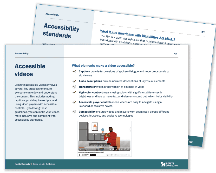
Accessibility Built into Every Design Decision
The updated guidelines embed accessibility from the ground up—ensuring content is easy to navigate and usable by all audiences.
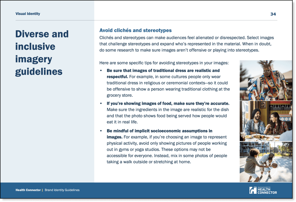
Making Imagery Reflect the Real World
MACHC’s updated photo guidance encourages the use of diverse, authentic images so every community sees itself represented.
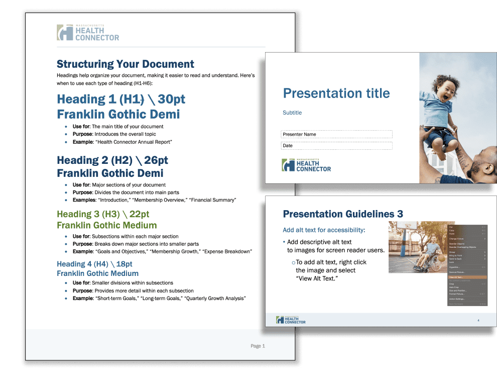
Ready-to-Use Templates for Health Equity Communication
We delivered accessible Word and PowerPoint templates that empower MACHC’s teams and partners to create consistent, easy-to-use materials.
Reflections
This work showed that accessibility and equity aren’t just design goals—they’re strategic foundations. Every decision was made to ensure MACHC’s materials could better connect with—and serve—the communities that need them most.