Building a Stronger Government Brand
Greatstille Marketing Firm
Why This Project Mattered
Greatstille, a national consulting firm, set out to develop a brand identity that reflects its commitment to innovation, operational excellence, and strategic impact. The goal was to craft a modern, cohesive system that communicates their forward-thinking approach and strengthens their presence in the public sector.
Approach and Delivery
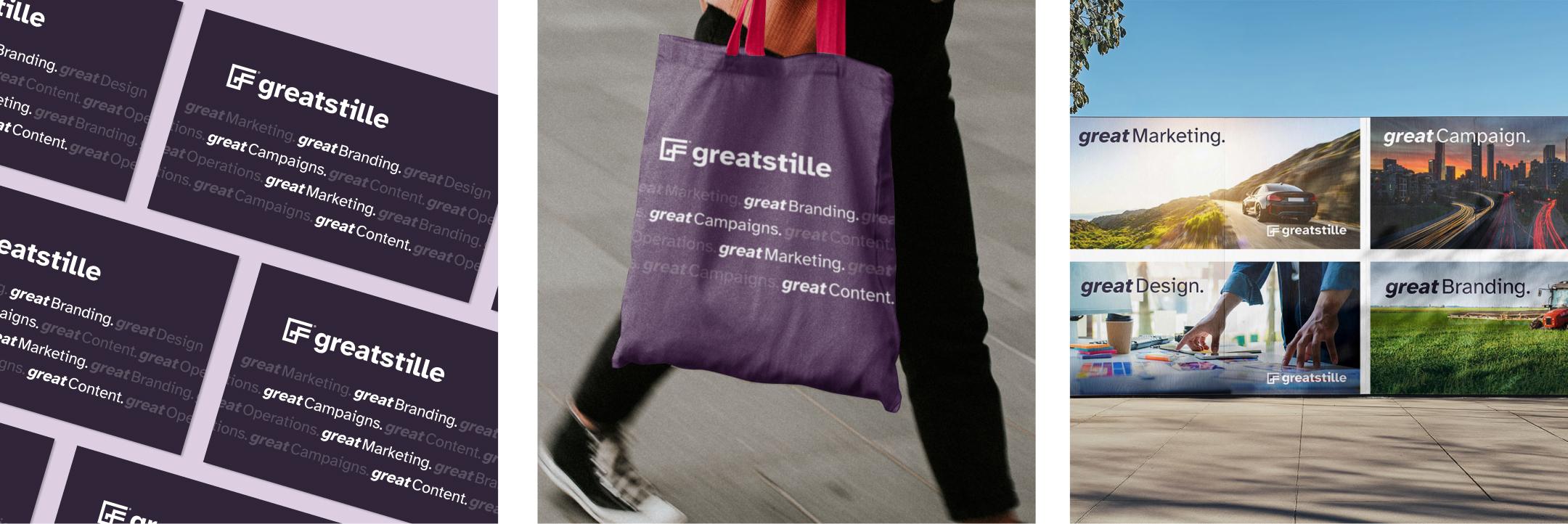
We created a flexible identity system that positions Greatstille as a leader in public-sector innovation. Built for clarity, consistency, and accessibility, the system strengthens recognition across platforms and ensures alignment with the needs of their agency partners.
A Symbol of Growth and Government Excellence
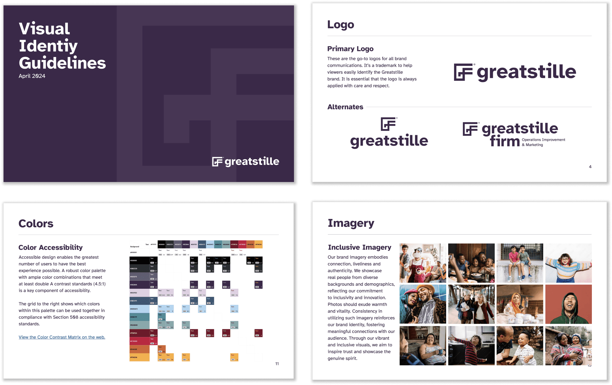
The Greatstille monogram combines the initials G and F into a forward-moving, structured shape—representing momentum, stability, and strategic focus. Its simple, geometric form ensures high usability across digital, print, and environmental applications.

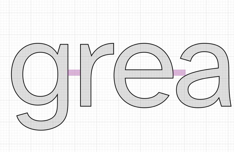
Typography That Balances Clarity and Authority
We chose Atkinson Hyperlegible, a typeface developed with the Braille Institute for maximum readability. Its distinct letterforms reduce confusion, making it ideal for public-facing content. This selection supports Section 508 accessibility standards while giving Greatstille a clean, confident voice across all formats.
Visual Consistency for a Stronger Brand Presence
A cohesive visual language builds recognition at every touchpoint—from marketing to formal reports—ensuring Greatstille consistently presents as a credible and partner in the marketing space.
A Color Palette Rooted in Trust and Innovation
A bold, graphic poster series helped spark curiosity and increase visibility in waiting rooms, clinics, and partner sites. Messages focused on facts, symptoms, and inclusive care to reduce fear and encourage early action.

Reflections
This project shows how accessible, strategy-driven design can strengthen a firm’s presence in civic and policy spaces. By building a clear, flexible identity system, we helped Greatstille show up with confidence—positioned as a trusted leader in operational transformation.