Creating an Accessible Knowledge Hub
Institute of Museum and Library Services
Why This Project Mattered
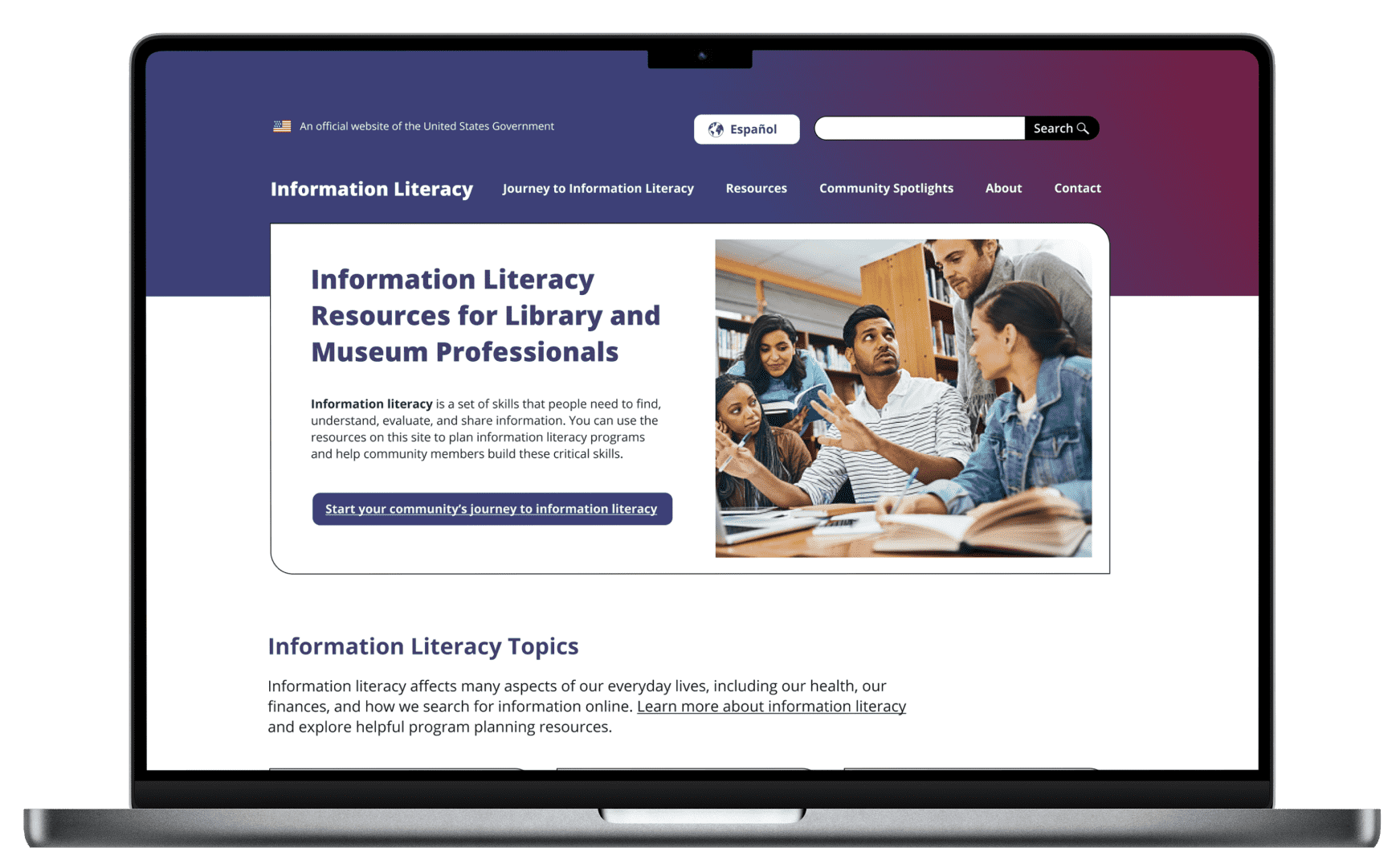
InformationLiteracy.gov serves as a central resource for educators, librarians, and policymakers, providing tools to help users evaluate and navigate information effectively. The platform required a modern, accessible homepage and a cohesive visual system that aligned with federal design standards. The goal was to create an intuitive user experience while ensuring compliance with accessibility best practices.

Approach and Delivery
We redesigned InformationLiteracy.gov's homepage to enhance clarity, structure, and visual impact. By implementing the U.S. Web Design System (USWDS), we ensured accessibility and consistency across all visual elements. The new design features color-coded buttons for intuitive navigation and callout boxes to highlight priority information, creating a user-friendly experience that aligns with federal standards.

Visual Distinctions with Color-Coded Buttons
The redesigned homepage uses color-coded buttons to create clear visual distinctions between sections, improving wayfinding and usability. Each button is strategically styled to help users quickly identify and navigate to key resources, making the experience more intuitive and efficient.

Highlighting Priority Information with Callout Boxes
A dedicated purple callout box was introduced to emphasize high-priority information. This design choice ensures that critical updates and essential guidance stand out, drawing immediate attention without overwhelming the overall page layout.
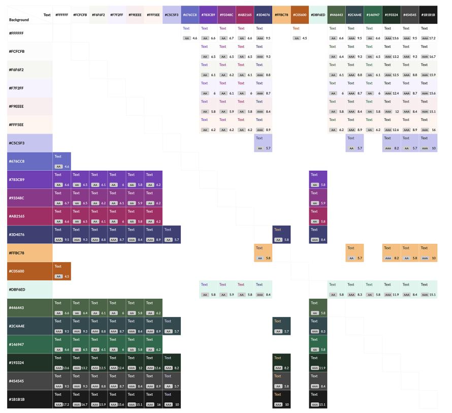
Standardized Accessibility with USWDS
The U.S. Web Design System (USWDS) was implemented to ensure consistency, accessibility, and federal compliance. This government-wide design framework provides standardized color contrasts, typography, and layout structures, making the platform both user-friendly and fully accessible for diverse audiences.
Reflections
This project reinforced the value of designing with both accessibility and clarity at the forefront. By prioritizing intuitive navigation and visual consistency, we created a more inclusive experience for users across a range of literacy levels. Collaborating within federal design standards challenged us to balance creativity with compliance—ultimately resulting in a cleaner, more purposeful interface.